So I read this great paper by cultural commentator Henry Giroux about the evolution of Benetton’s advertising visuals, and I thought it was worth discussing in a bit more detail.
Giroux talks about how we often forget that politics can catalyze certain desires of the public as much as it can inflame tension or be tedious, procedural and beurocratic. I’d add that one of politics’ only possible seductive dimensions is those dynamics that relate to domination and submission – consider the soldier’s often weary but unflinching loyalty to the army. This or the libidinal instincts initiated by the suggestion of lawlessness, revolution and upheaval represent politics’ more tantalising side.
The mass communications and entertainment industries have subjected politics to the same processes of aestheticization (making decorative) and commodification (making purchasable) as everything else in our world. This helps to bring these seductive dimensions to the fore - and it does so primarily via visuals.
Giroux talks out how in an age where community cohesion itself is degraded, imagery is used to create false ‘universal visions’ to which we can align ourselves and feel united. These images present us with new forms of ‘tribalism’ we can buy into with little emotional, practical or political investment. Invoking universal ideas necessitates the denial of specificity, which renders the images ahistorical. Ahistorical visions – particularly utopian ones – have often been used as an exploitative weapon of totalitarian regimes, cults or corporations because they suggest social healing in a way that smooths over the contradictions that make such a cohesive public body so difficult to achieve.
Fashion has always tended to present itself as a sort of utopia – the elitist origins of high fashion finery have always promoted fantasy and escapism, which proved difficult to shake until, arguably, the heroin chic aesthetic disrupted the pages of glossy magazines in the 1990s. But as Giroux argues, it has tended to engage in the aforementioned process of levelling out inequalities, tensions and political ruptures that offer us a nuanced vision of the future to work towards: a ‘protopia’ - an imagined future that is once ideal and pragmatic.
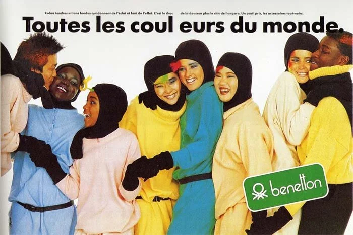
United Colors of Benetton advert, French version, F/W 1984, “All the colours in the world”
Giroux looks at Benetton’s 1980s imagery as naïve - presenting us with a utopia of little substance. He bemoans the childish primary colours of the garments and the dynamic but contextless movement of the models who variously leap and play themselves across the spread in a sort of purgatorial white space. This vision of harmony, he declares, reads as being ‘flat’ and depoliticized. He notes how this felt particularly out of step with society at the time in the late 70s and early 80s, which was experiencing a range of profound economic and social shifts.
United Colors of Benetton advert, Italian version, F/W 1984, “All the colours in the world”
I’ve felt a similar frustration with shows of diversity within fashion images. Don’t get me wrong - I am glad that they are there and more present in the past 5 years, but shouldn’t displays of difference within fashion imagery do more to articulate the real benefits and joys of a more diverse society rather than just regurgitate images of itself for its own sake?
These ‘flat’ images may be racially varied but if they remain ‘flat’ in the way Giroux suggests, they will register no more than stock imagery and be signed off as mere try-hard tropes. He summarizes this brilliantly by calling these half-heartedly world-peace-invoking images as ‘brief shows of flexibility at the surface that mask intransigence at the core.’
La Pieta, United Colours of Benetton Advert, 1991.
The use of the Benetton logo in their adverts helps to designate them as ‘cultural objects’ as opposed to fine art, or some form of journalistic visual activism. In this way, they also fence off the arena between ‘real politics’ and ‘optics’ whilst also creating and feeding an identity politics of their own that is grounded in the act of buying. That means one thing in the context of the above spreads that are, according to Giroux, ‘flat’ but offensively ornamental and vibrant, but take on a new dimension as Benetton’s visual strategy becomes more politically provocative as it moves into the 1990s.
The critique of fashion images as exclusively articulative of difference (and not productive of it) is a fair one to make given that few creatives are really seizing the medium to create meaningful and catalyzing narratives. However, we should recognise that fashion imagery does have the capacity to encourage our social reality in certain directions.
Kate Moss photographed by Corinne Day, 1990.
The issue is that we tend wrapped up in the examples in which this has negative consequences – like when Heroin Chic caused a youth delinquency panic, or how Victoria’s Secret angels inducted a generation of young women into disordered relationships with food. If we relegate all commercial imagery to only holding, as Giroux says, ‘the promise of producing social criticism’ then we are seriously limiting our pedagogies for both articulating and contributing to a rewiring of the civic imagination.
In truth, contemporary fashion imagery has been most successful in its ‘production of lifestyle.’ It has managed to give birth to a veritable taxonomy of lifestyles that consumers can participate in through purchasing. Products are mapped out in increasingly convenient ways, previously in fashion editorials that gave order and sense to different garments and now in hyper-targeted digital adverts that follow us around cyberspace.
Different figurations of these lifestyles are harmonized within seductive and surprisingly standardized aesthetic logics. Van der Laan and Guipers define this phenomenon in an excellent paper in which they uncover that fashion imagery has some astonishingly consistent conventions across time that pull together aspirational motifs and specific visions of beauty.
In this way, consumer groups are no longer marketed to by social class but by their ‘preferred identities’ and ‘lifestyle aspirations’ that imply individual choices supersede social inheritances. It seems we aren’t selling to ‘consumers’ anymore... but to ‘characters.’ The online subcultures we are left with – often called core aesthetics – are the logical progression of what Giroux called ‘commodified subject positions’ that were set in motion in the 1980s when Benetton was producing political discourses through their fashion campaigns.
The emphasis of these core aesthetics is on flattened visual styles. Ana Kinsella on the Dirt substack this week described this as ‘people dressing like they’re from the internet.’ These core aesthetics are serviced by the global megacorporations of fast fashion, whose design processes are entirely data-driven and devoid of artistic agency and vision. These core aesthetics lack any consistent and cohesive political ideological glue. This is what makes them flat AND flimsy. These core aesthetics are the product of an algorithm, so that they evolve into neatly delineated marketable segments is entirely natural.
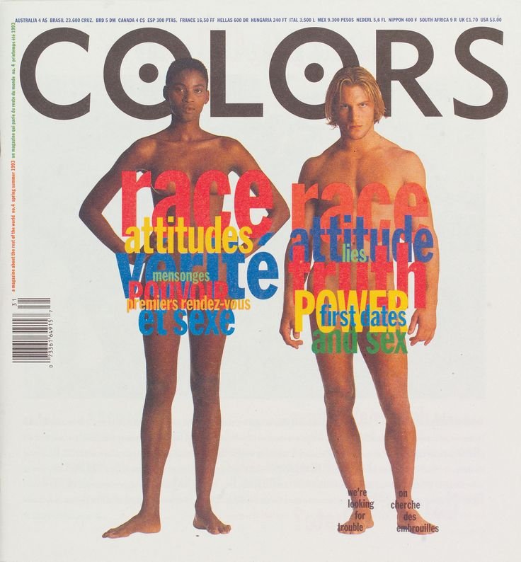
Giroux also talks about the impact of convergence culture on how Benetton positioned itself in the marketplace editorially – their branded magazine ‘Colors’ merged entertainment forms with subcultural content to appeal to rebellious youth cultures. Of course, that a European company even spells colours in its American form for its brand name and in-house publication has a certain irony to it.
‘Colors’ Magazine by United Colors of Benetton
It contained a blend of advertising image spreads, fun and light-hearted articles and deep dives into global issues. Were these ideas being “contained” by the fashion format they were bound by? Did this sanitize them or keep them away from real political enquiry because they were “just” promotional magazines, even if they presented as more than that?
‘Colors’ Magazine by United Colors of Benetton featuring a cover image that showed the shocking extent of the migrant crisis
Advertising IS a packaging process and we have to acknowledge that. It is a packaging process of the product, brand equity and political ideas (whether implied or explicitly shown). This packaging process will emphasize, exaggerate, expand or selectively hide certain elements according to the zeitgeist and the vision of the brand team. The exaggerated element often comes in an inflation of the transformative qualities of the product being sold – for example – this dress will change your entire life!
The expansion process builds up the brand story in order to construct and uphold its symbolic mythological value in the eyes of its consumers. What is hidden is what is not shown. All of these decisions and their resulting visuals build the rhetoric of an advertising image and each layer is ripe for deconstruction and analysis - in isolation, in its field and in the broader marketplace of culture.
I sometimes worry that the critique that all commercial forms of media are depoliticized because they are commercial forms may inoculate fashion imagery from being considered powerful, thereby obscuring its true potential. If fashion images are always ‘tainted’ by consumerist processes, it is another visual form that is lost as a tool. We might not have to avert our gaze from these images, but we are forgiven for following through on anything if they are ‘just adverts.’ A robust defence of them is not required, meaningful discussions around their production are not required, and academic enquiry into their significance is simply a quirky personal undertaking.
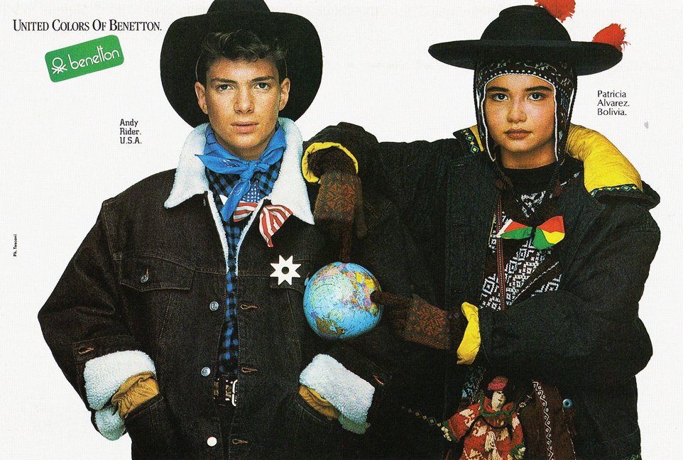
United Colors of Benetton advert, 1986.
The strength of advertising as a way of submitting political messages, or at least initiating conversations around subjects in need of awareness, is that it cannot complicate or thicken discourse by its nature. Advertising must simplify and translate as a matter of priority. Historical or academic texts, on the other hand, have not placed much if any importance on accessibility or appearing appealing. Fashion imagery may be considered a sort of commercial folk devil by the academic establishment, but that is exactly why we should be inviting people to interrogate it more frequently. We can’t continue to make demands that fashion becomes political and then shy away from critiquing its politically-engaged products by saying they are entirely negated by the commercial processes intrinsic to the fashion system
We often declare that ‘fashion is an art form’ but if we really stood by this conviction, we would not hesitate to treat it as such.


